UN Backs a New World Map Showing Africa’s True Size — With the U.S
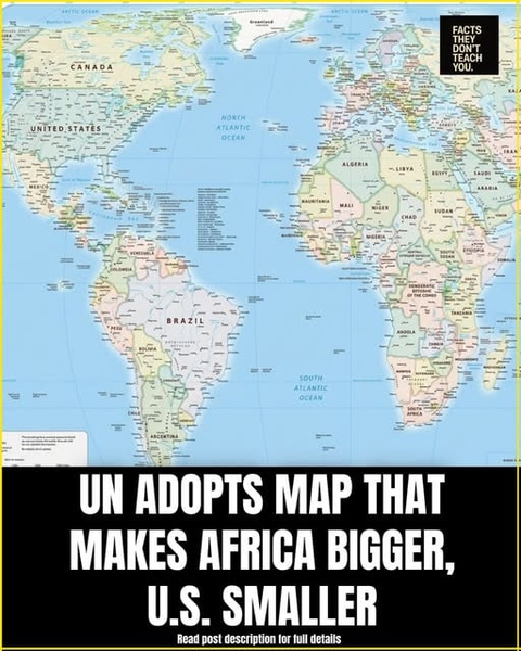
NEW YORK — The United Nations General Assembly has endorsed an Africa-led initiative calling for greater use of world maps that more accurately represent the true size of continents, marking an unusual global dispute over something most people rarely question: the map hanging on the classroom wall.
The resolution, sponsored by Togo and backed by the African Union, encourages governments, schools, international organizations and technology companies to move away from the traditional Mercator projection toward equal-area projections such as Equal Earth.
The vote was overwhelmingly in favor: 164 countries supported the resolution, six abstained and only the United States voted against it.
But despite the dramatic viral framing that the U.N. has adopted a map that makes “Africa bigger and the U.S. smaller,” the reality is more nuanced. The U.N. did not legally replace the world's maps, ban the Mercator projection or physically change the size of any country. The resolution is non-binding and primarily encourages a different way of visually representing the Earth's surface.
Why Does Africa Suddenly Look So Much Bigger?
The controversy revolves around the Mercator projection, created by Flemish cartographer Gerardus Mercator in 1569.
Mercator's map was designed primarily for navigation. It has an important advantage: straight lines on the map can represent constant compass bearings, making it extremely useful for sailors.
The problem is that accurately preserving direction comes at the expense of accurately representing area.
As land gets farther from the equator, it appears increasingly enlarged.
That is why Greenland can look comparable in size to Africa on a conventional Mercator world map, even though Africa is roughly 14 times larger than Greenland in reality.
The same effect makes North America and Europe appear disproportionately large compared with regions closer to the equator, including much of Africa and South America.
Equal Earth Changes the Visual Picture
The Equal Earth projection, developed in 2018 by cartographers Bojan Šavrič, Bernhard Jenny and Tom Patterson, is designed to preserve the relative areas of continents and countries more accurately.
Africa therefore occupies a much larger-looking portion of the map than it does on Mercator.
The United States, Canada and Greenland, meanwhile, appear less exaggerated in size.
But this does not mean the United States has somehow been made geographically smaller.
Its actual territory has not changed by a single square mile. What changes is the mathematical projection used to transform Earth's three-dimensional surface onto a flat sheet of paper or a screen.
Every flat world map involves some form of distortion. Equal Earth reduces distortion of area, but it does not perfectly preserve shape, distance or direction.
The U.S. Was the Only Country to Vote No
The most politically striking element of Friday's vote was not the map itself but the voting pattern.
The United States was the only country to oppose the resolution, while six countries — Estonia, Georgia, Lithuania, Moldova, Serbia and Ukraine — abstained.
The U.S. representative Yaryna Ferencevych criticized the initiative as part of what she described as a broader “radical ideological project” at the United Nations.
Washington argued that the U.N. should concentrate on what it considered more substantive international challenges, including peace, prosperity and relations among countries.
That position put the United States on the opposite side of an initiative supported by virtually the entire General Assembly.
Africa's Campaign Is About More Than Cartography
For African governments and campaigners, the issue is not simply about choosing a prettier or more scientifically accurate map.
Togo has connected the campaign to a broader effort to challenge historical representations of Africa and the legacy of colonialism.
Togolese Foreign Minister Robert Dussey described the initiative as a question of how the world understands Africa's place and importance.
Reuters reported that Togo sees the widespread use of Mercator as partly connected to the history of European colonialism, while emphasizing that the campaign is not intended as an attack on Europe.
The African Union endorsed the broader “Correct the Map” campaign in 2025, helping turn what might otherwise have been a technical cartography debate into an international political and cultural issue.
Supporters argue that repeatedly seeing Africa represented as relatively small can influence people's subconscious understanding of the continent's geographical scale and global importance.
A Powerful Comparison: Africa and Greenland
The most striking illustration is Greenland.
On many familiar Mercator maps, Greenland appears almost comparable in size to Africa.
In reality:
- Africa: about 30.4 million square kilometers
- Greenland: about 2.2 million square kilometers
- Africa is roughly 14 times larger.
The discrepancy is so dramatic that the comparison has become one of the central arguments behind the Correct the Map campaign.
And Africa is not the only region affected. South America is also visually reduced relative to northern-hemisphere territories under Mercator.
The U.N. Did Not “Ban” the Old Map
This is where some viral headlines go too far.
The resolution does not prohibit Mercator maps.
It does not require Google Maps, Apple Maps, schools or governments to immediately replace every existing map.
It also does not invalidate Mercator for navigation.
In fact, the resolution specifically leaves room for the continued use of Mercator for maritime and aerial navigation, where its mathematical properties remain useful.
Instead, the resolution encourages institutions to use projections that better communicate the actual relative size of the world's regions.
Togo Wants Schools to Change First
Togo says it intends to move quickly.
Foreign Minister Dussey told Reuters that the country plans to update its geography materials and aims to introduce the new approach in schools by the end of 2026.
Togo also plans to work with African Union members, international organizations and technology companies involved in mapping and location services to encourage broader adoption.
That could eventually have a much greater impact than the U.N. resolution itself.
If schools, textbooks, news organizations and digital mapping platforms increasingly use equal-area projections, future generations may grow up with a substantially different visual understanding of the planet.
A Map Can Change How People See the World
The debate ultimately raises a deceptively simple question:
What should a world map be designed to show?
Mercator prioritizes navigation.
Equal Earth prioritizes relative land area.
Other projections make different compromises between shape, distance, direction and area.
There is therefore no single flat map capable of showing the spherical Earth without distortion.
What makes the U.N. vote significant is not that the planet has been redrawn, but that 164 countries agreed that the way the planet is visually represented deserves reconsideration.
The viral claim that the U.N. has made Africa “bigger” and America “smaller” is therefore misleading.
Africa was always that large. The United States was never actually made smaller.
What changed was the map — and, potentially, the way millions of people will see the world.
Comments (0)
Loading comments...
May You Like
Shocking news from Ohio: an unexpected development ahead of Trump's rally
FIGHT OVER OBAMA’S IRAN POLICY