UN Endorses New World Map Designed to Show Continents More Accurately
The United Nations General Assembly has backed the Equal Earth projection, challenging the centuries-old dominance of the Mercator map and highlighting how conventional world maps can distort the relative size of continents.
A world map that has been familiar to generations of students could be facing a major rethink after the United Nations General Assembly endorsed a new approach to depicting the planet.
On September 4, 2026, the General Assembly backed a resolution supporting the use of the Equal Earth projection, a map designed to represent the relative area of continents more accurately than the widely used Mercator projection. The vote was led by Togo and supported by African countries and the African Union.
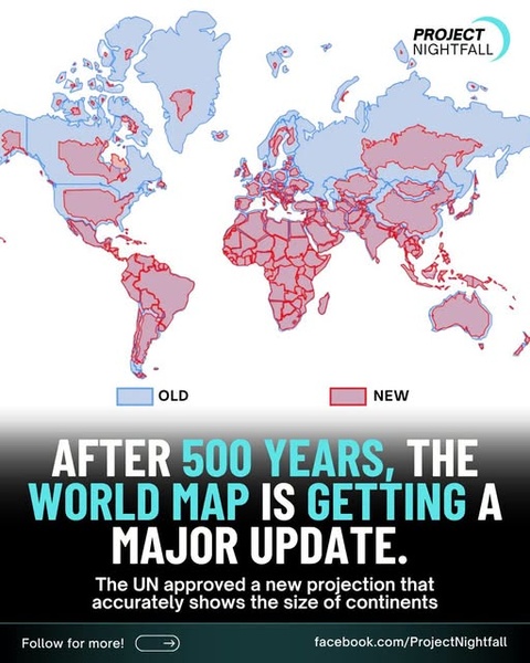
The development is reflected in a widely shared graphic that compares an older map with a new projection and says the world map is receiving a “major update” after centuries of use.
However, there is an important distinction: the United Nations has not banned the Mercator projection or ordered every map in the world to be replaced. The resolution is non-binding and encourages governments, educational institutions and other organizations to use projections that provide a more accurate comparison of land areas.
Why the Mercator Map Makes Africa Look Smaller
The Mercator projection was developed by Flemish cartographer Gerardus Mercator in 1569, primarily to assist maritime navigation.
Its major advantage is that lines representing constant compass directions can be drawn as straight lines, making the projection particularly useful for sailors. But preserving direction comes at the expense of accurately representing area.
The farther a location is from the Equator, the more its landmass is enlarged on a standard Mercator world map. The distortion is particularly noticeable in Greenland, northern Europe and North America.
One of the most striking comparisons is Greenland and Africa.
On many Mercator maps, Greenland appears roughly comparable in size to Africa. In reality, Africa is about 14 times larger than Greenland.
The same distortion affects South America, South Asia and other regions closer to the Equator, which appear relatively smaller than their actual land area.
What Is the Equal Earth Projection?
The Equal Earth projection was developed in 2018 by cartographers Tom Patterson, Bojan Šavrič and Bernhard Jenny.
Unlike Mercator, it is an equal-area projection. That means the relative areas of countries and continents are preserved more accurately, although the shapes of some landmasses are necessarily altered.
This is an important point in understanding the debate: there is no perfectly accurate flat map of the entire Earth.
Because Earth is spherical, transferring its surface onto a flat sheet or screen inevitably introduces some form of distortion. Different projections prioritize different characteristics, including area, shape, distance or direction. The U.S. Geological Survey notes that no flat map can simultaneously preserve all of these properties.
The Equal Earth projection therefore is not simply a “perfect” map. Its principal advantage is that it provides a more realistic comparison of the size of landmasses.
Africa Is at the Center of the Map Debate
The campaign behind the UN resolution has been driven heavily by African governments and advocacy organizations.
Togo led the initiative at the United Nations, building on a campaign supported by the African Union. Supporters argue that maps are not merely technical tools: they influence how people perceive the relative importance and size of different parts of the world.
The United Nations Office of the Special Adviser on Africa said the Mercator projection's area distortion has contributed to what supporters describe as the symbolic minimization of Africa. The UN-backed initiative promotes Equal Earth as an alternative that better represents relative continental size.
The advocacy group Africa No Filter, which helped lead the “Correct the Map” campaign, has called for more accurate projections to be used in schools, textbooks, newsrooms and digital platforms.
The Vote Was Overwhelming — But Not Unanimous
The General Assembly vote produced strong international support.
Reuters reported that 164 countries voted in favor, six abstained and the United States was the only country to vote against the resolution.
The resolution does not legally require countries to abandon Mercator. Instead, it encourages greater use of projections that represent land areas more accurately.
That distinction is important because Mercator remains useful for certain technical purposes, particularly navigation. Even the campaign supporting the change acknowledges that the projection remains suited to maritime and aerial navigation.
The Map Is Changing — But Geography Isn't
The viral graphic is broadly correct in presenting the UN vote as an important development in how the world may be represented visually.
But its wording that the world map is simply “getting a major update” can be misleading if interpreted as meaning that the UN has imposed a single replacement map worldwide.
The Equal Earth projection itself is not new. It was created in 2018, and different world maps have used alternative projections for decades. What is new is the UN General Assembly's 2026 endorsement of a resolution encouraging the use of area-accurate projections, particularly Equal Earth, in educational and informational contexts.
Nor is the Mercator projection geographically “wrong.” It was designed for a specific purpose and remains valuable for navigation. The problem arises when a navigation-oriented projection is treated as though it accurately communicates the relative size of continents.
Why This Matters Beyond Geography Classrooms
The debate over world maps reflects a larger question about how visual representations shape people's understanding of the world.
For generations, students have encountered maps in which Europe, North America and Greenland appear considerably larger relative to Africa and South America than they actually are.
The new UN initiative does not change the physical geography of the planet. Instead, it seeks to change how that geography is represented.
As the debate moves forward, schools, publishers, news organizations and digital mapping companies will decide whether — and how quickly — to incorporate alternative projections.
For ordinary map users, the most important lesson may be that every flat world map involves compromises. The map people have seen most often is not necessarily the map that best answers every geographic question.
The UN vote represents a significant push toward making those compromises more visible — and toward showing the world's continents in proportions closer to reality.
What the viral graphic gets right — and what it leaves out
✔ Correct: The UN General Assembly endorsed a resolution supporting the Equal Earth projection in September 2026.
✔ Correct: The Equal Earth projection represents continental areas more accurately than the conventional Mercator projection.
✔ Correct: Africa appears dramatically larger relative to Greenland, Europe and North America on an equal-area map.
⚠️ Missing context: The Equal Earth projection was created in 2018, not in 2026.
⚠️ Missing context: The UN resolution is non-binding and does not prohibit the Mercator projection.
⚠️ Important nuance: No flat world map can perfectly preserve area, shape, distance and direction simultaneously. Different projections serve different purposes.
Comments (0)
Loading comments...
May You Like

Jack Smith Defends His Integrity as Trump Investigations Face Renewed Political Firestorm